Art Director · Design Consultant · Milan

Davide
Melotti

I never specialised, and it isn’t for lack of focus: it’s a choice. Interfaces, brands, typefaces — and one more field every year.

Twelve years spent widening the perimeter instead of narrowing it. SaaS platforms and apps used on the road, technical e-commerce, brand identities from the name to the packaging, typefaces both commissioned and commercially released. Every new field makes the ones I already knew more solid: someone who has drawn a typeface understands a design system before seeing one, and someone who has built a brand knows why a purchase path has to be written before it is designed.

This profile is what you want when the problem hasn’t been defined yet: creative direction and consulting, the craft of holding different specialists together and speaking everyone’s language — designers, developers, client. Right now I’m adding information security and red teaming of AI systems, because that is where the risk in digital products is moving.

II

Brand identity

Brands built from the name to the packaging, for businesses that need to be recognised in markets where everything looks alike.

01

Mega Production

Production house

Identity for a production house: mark, colour system, photographic direction, printed materials, merchandise and website.

The problem

A production house sells imagination and has to prove it on everything it prints. The mark had to hold up small on a card and at two metres on a poster, and stay recognisable even reduced to a single letter.

What I designed

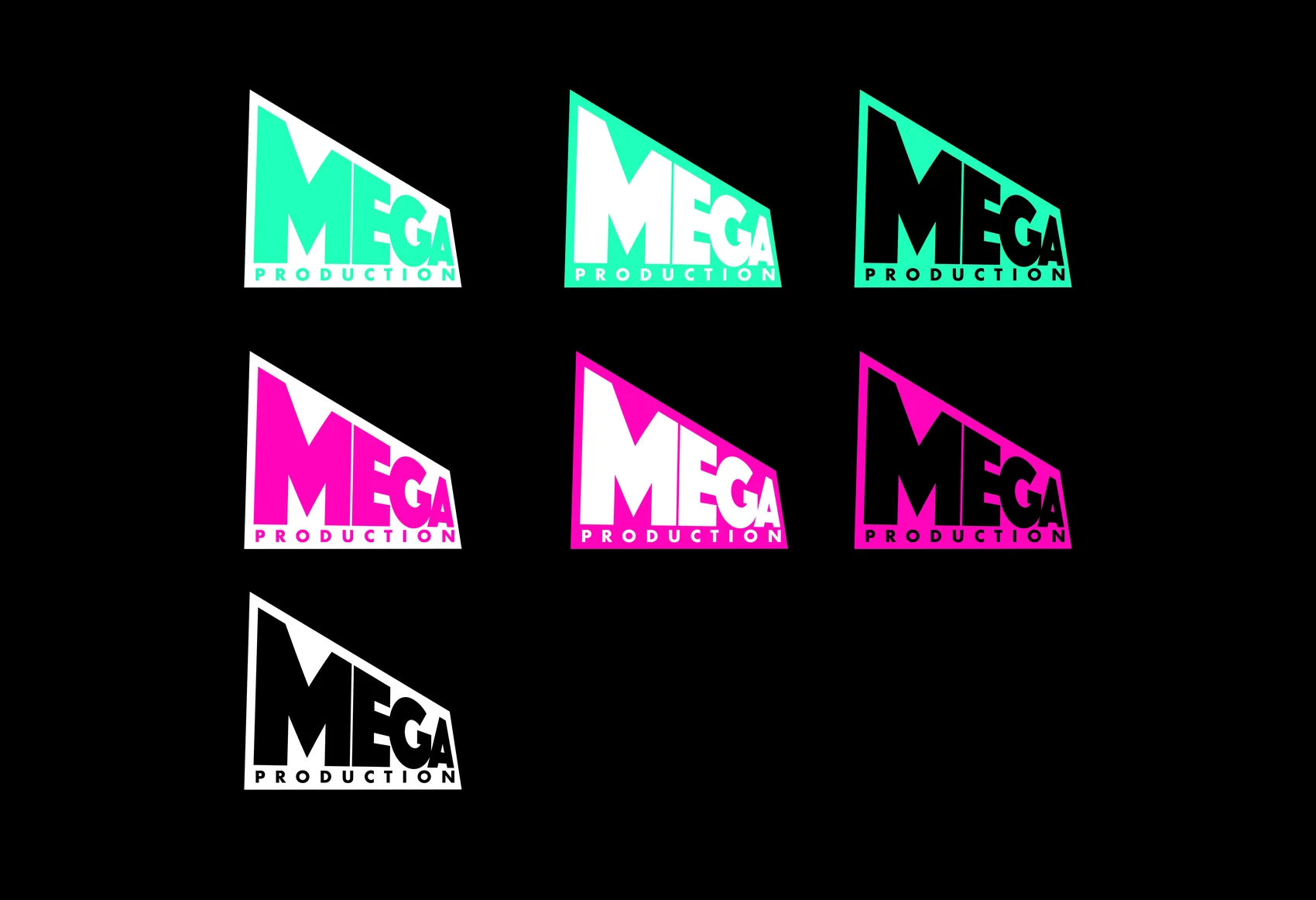
  • A mark built inside a slanted quadrilateral, like a frame seen at an angle: the shape says “screen” before the name is even read.
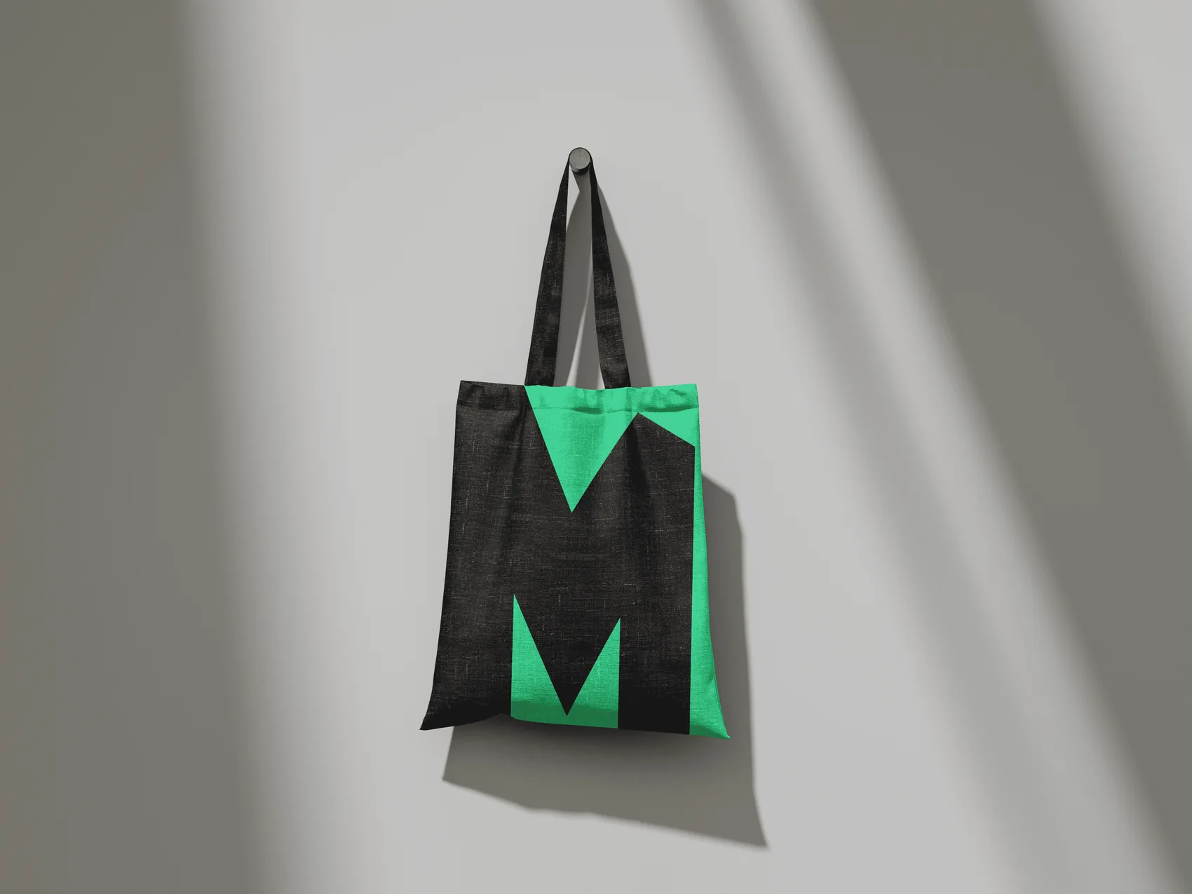
  • The M is drawn to live on its own: detached from the logotype it becomes a monogram and goes onto bags, shirts and folders without losing identity.
  • Three high-contrast colour pairs — mint, magenta, white, always against black — and seven declared lock-ups, so the mark works on light, dark and coloured grounds with no improvised decisions.
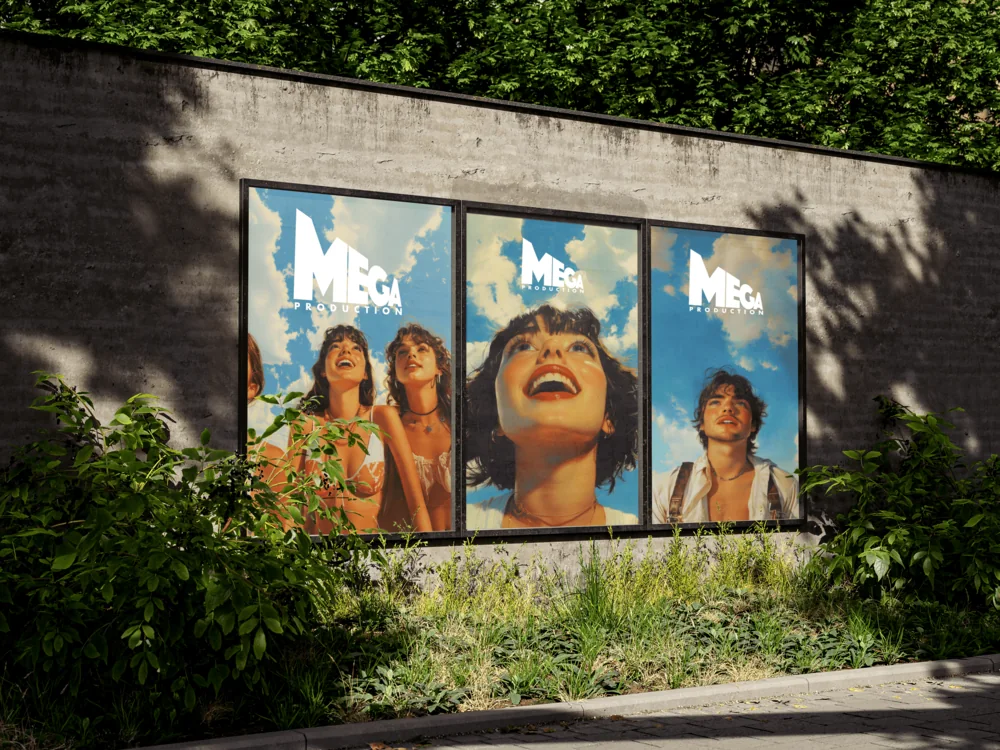
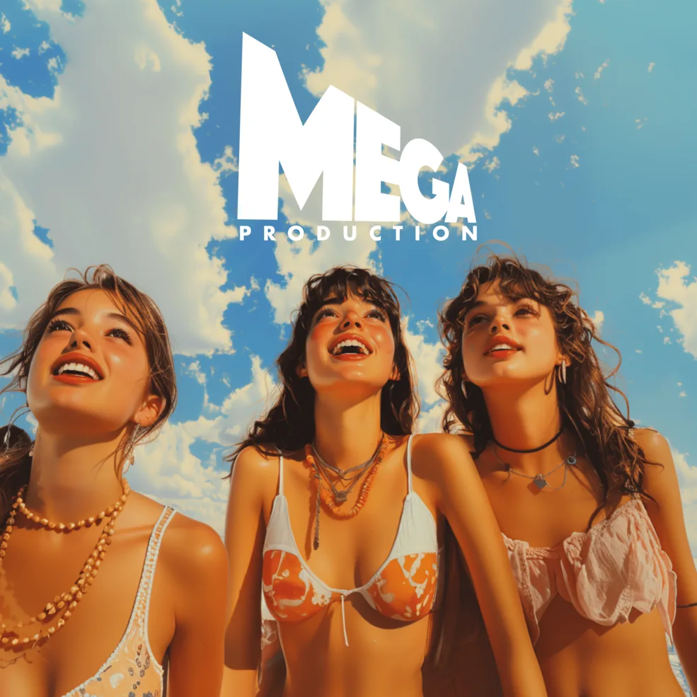
  • A constant photographic direction: low angle, sky, high saturation. Always the same point of view, that of someone looking up.
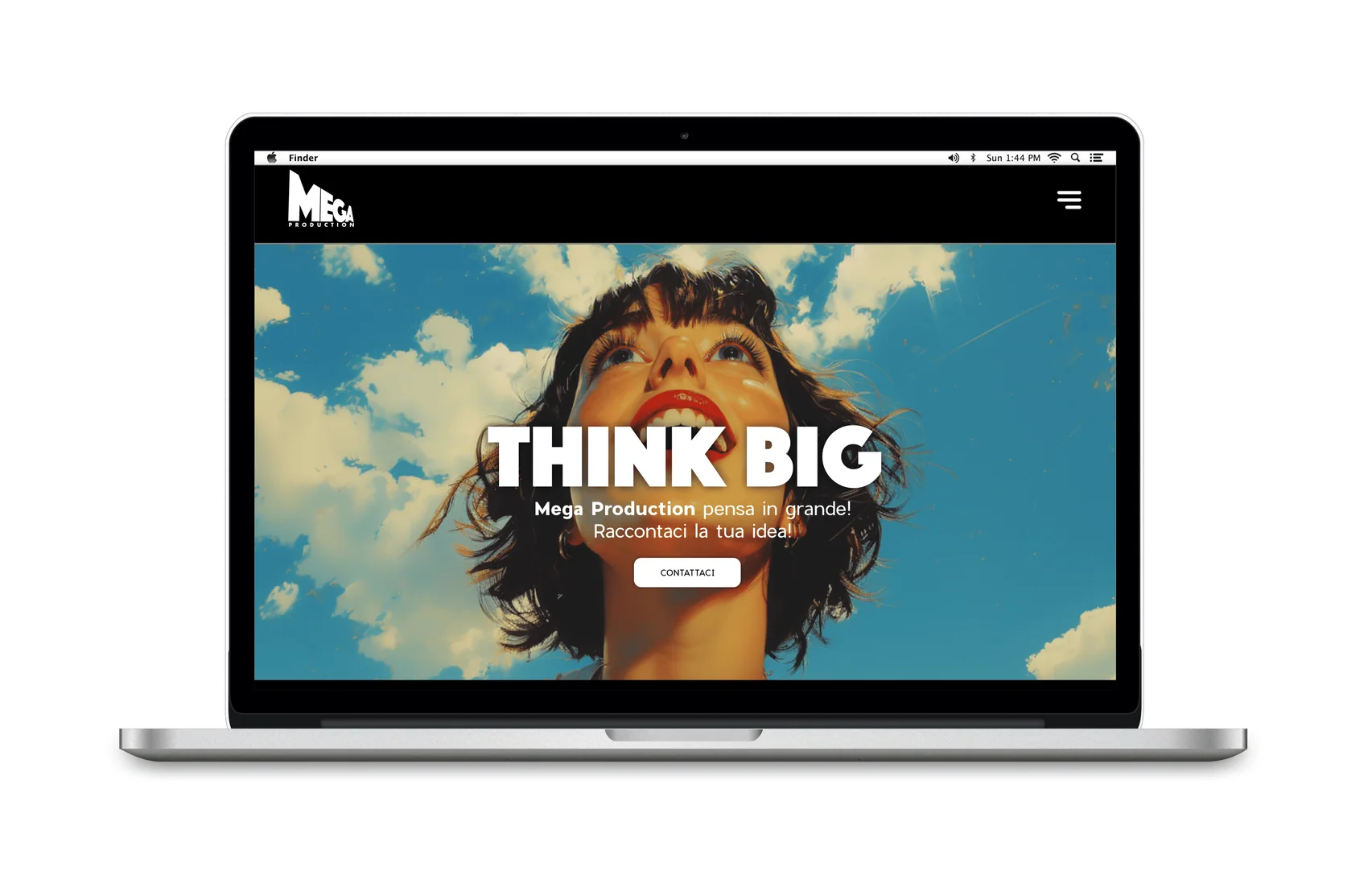
  • The Think big payoff carried from the poster to the site, where the home opens on those two words and a single call to action.
  • The system applied to cards, folders, outdoor posters, t-shirts, tote bags, social and website.
The mark and its seven variations: mint and black, magenta and black, white and black. All declared, so nothing gets improvised on the first coloured ground.
The photographic direction: always the low angle, always the sky. It’s the point of view of someone looking up, which is also what the payoff means.
On a poster the system holds its distance: the mark in white stays legible over any sky.
Two-sided business cards: image on one side, solid colour cut by black on the other. Neither looks like the back of the other.
The M blown up until it runs off the format becomes a graphic ground: folders and flyers use the same letter as the logo, not an added pattern.
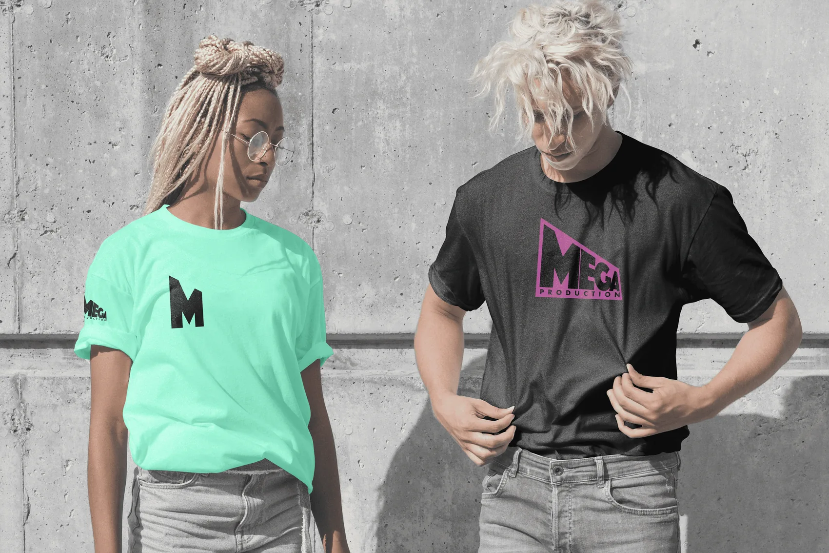
On merchandise the mark splits in two: the letter alone on the chest, the full logotype on the sleeve or centred.
The M as a monogram filling the bag, reversed between black and green: the sign works even with no name beside it.
In feed the image arrives before the mark, which settles bottom right like a signature.
The site opens with the two words of the payoff and a single call to action: tell us your idea.
02

Mirtilia

Milan, 2024

A new brand identity for a local blueberry farmer.

The problem

A small local grower ends up on the shelf next to industrial brands with photographic budgets. It couldn’t win on realism: it had to win on recognition, with something you remember after seeing it once.

What I designed

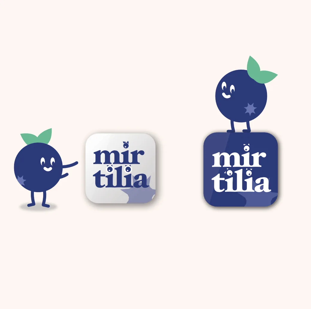
  • The mark comes from botany: the five-pointed star a blueberry carries on its crown becomes the graphic sign running through every application.
  • The tittles on the i replaced by blueberries with leaves. The name carries the product inside it and stays legible down to a few millimetres.
  • Two lock-ups for two uses: stacked for square formats and icons, a horizontal plaque for signs and labels.
  • A character — a walking blueberry — for social, packaging and anything that needs a voice rather than a logo.
  • A palette of night blue, cream and leaf green: the colour of the fruit becomes the ground rather than the subject, so the real product stands out on top of it.
  • Applications down to the detail of the business card, where the brand’s tone ends up deciding the job title printed under the name.
The stacked logotype and the plaque version. The tittles on the i are blueberries with leaves, and the star behind is the crown the fruit actually has.
Plaque and horizontal lock-ups: two shapes for two uses, sign and label, with nothing redrawn.
App icon in positive and negative. At minimum size the name, the star and nothing else survive.
The character: a walking blueberry. It works where a logo isn’t enough — social, packaging, anything that needs a voice.
Character and mark coexist without overlapping: one introduces, the other identifies.
On the business card the printed job title reads “Boss Mirtillo”: the brand’s tone decides even what goes under the name.
03

Elephant Café

Milan, 2025

Brand identity, packaging, social communication and accessories for a coffee shop.

The problem

A coffee shop has a few seconds and a few centimetres to be recognised: the sign glimpsed in passing, the bag on the counter, the post going by. It needed a sign that stayed itself from a two-centimetre roundel on a sachet to the face of a half-kilo pack.

What I designed

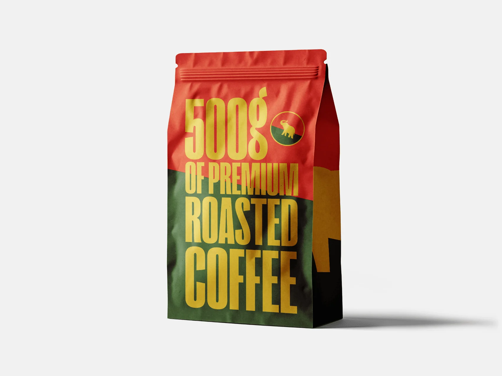
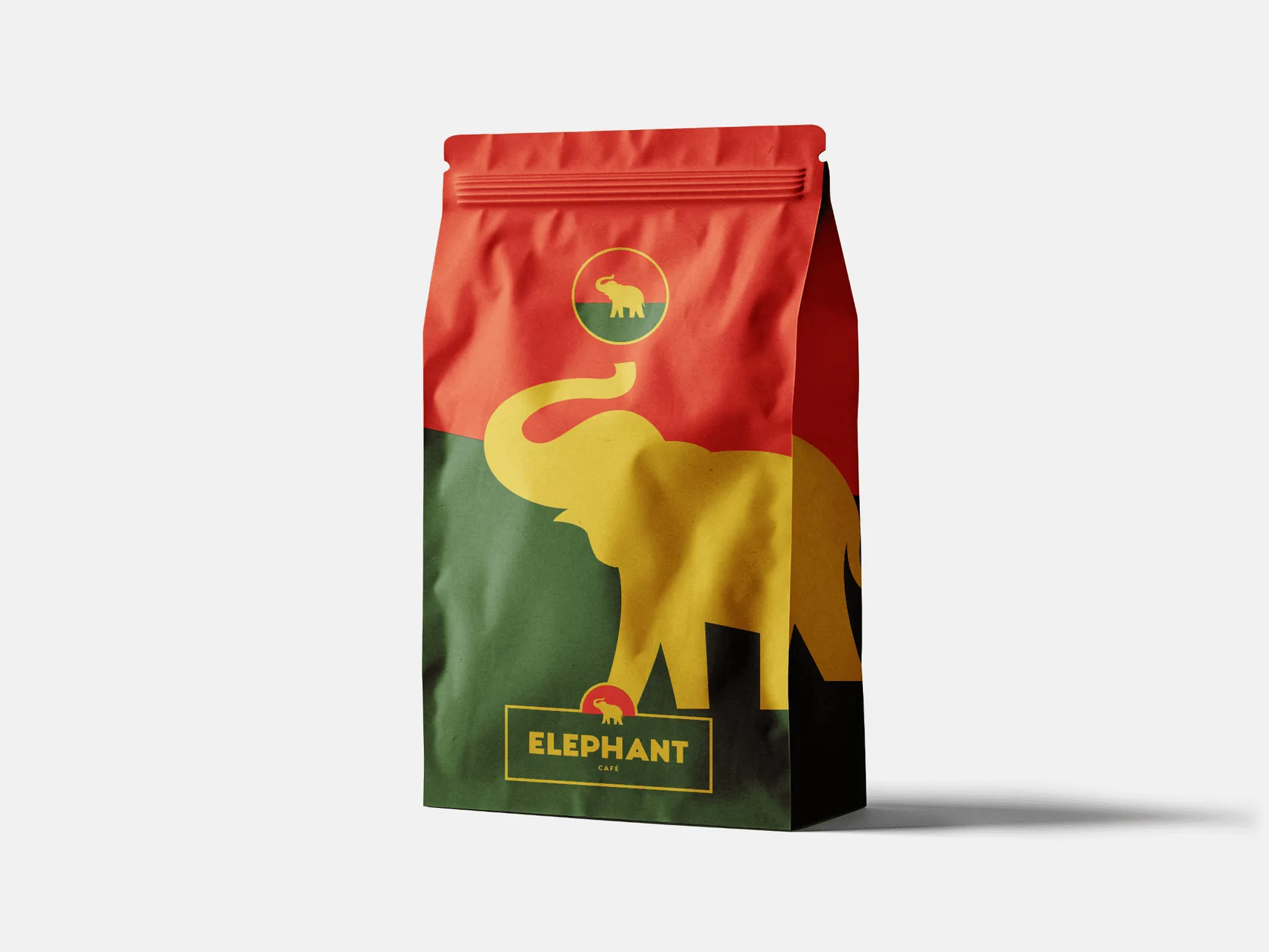
  • A single graphic device carries the whole system: the horizon line cutting red from green. It is the sun behind the elephant in the emblem, and it is the same cut that divides bag, tote, sachet and post.
  • A two-tier mark — round emblem and plaque with logotype — because the two extremes of scale ask for two solutions, not an enlargement of the same one.
  • The elephant is drawn as a solid silhouette with no internal detail: it survives small print, embroidery and a phone screen.
  • Heavy condensed type used as a speaking voice: Tastes goooood with the o’s stretched until they fill the line. The typographic joke is also how the text is made to fall exactly into the column.
  • The back of the pack given over to type alone, so the two faces divide the work instead of repeating each other.
  • The system applied to coffee packaging, menus, folders, teapot, sachets, three versions of tote bag and a social editorial plan.
The coffee bag: the line dividing red from green is the horizon, and the elephant walks along it just as in the emblem.
The reverse is type alone. Front and back don’t compete: one does the image, the other the information.
Folders, clipboard menu, teapot and sachets. The round emblem holds the small format, the plaque the large one.
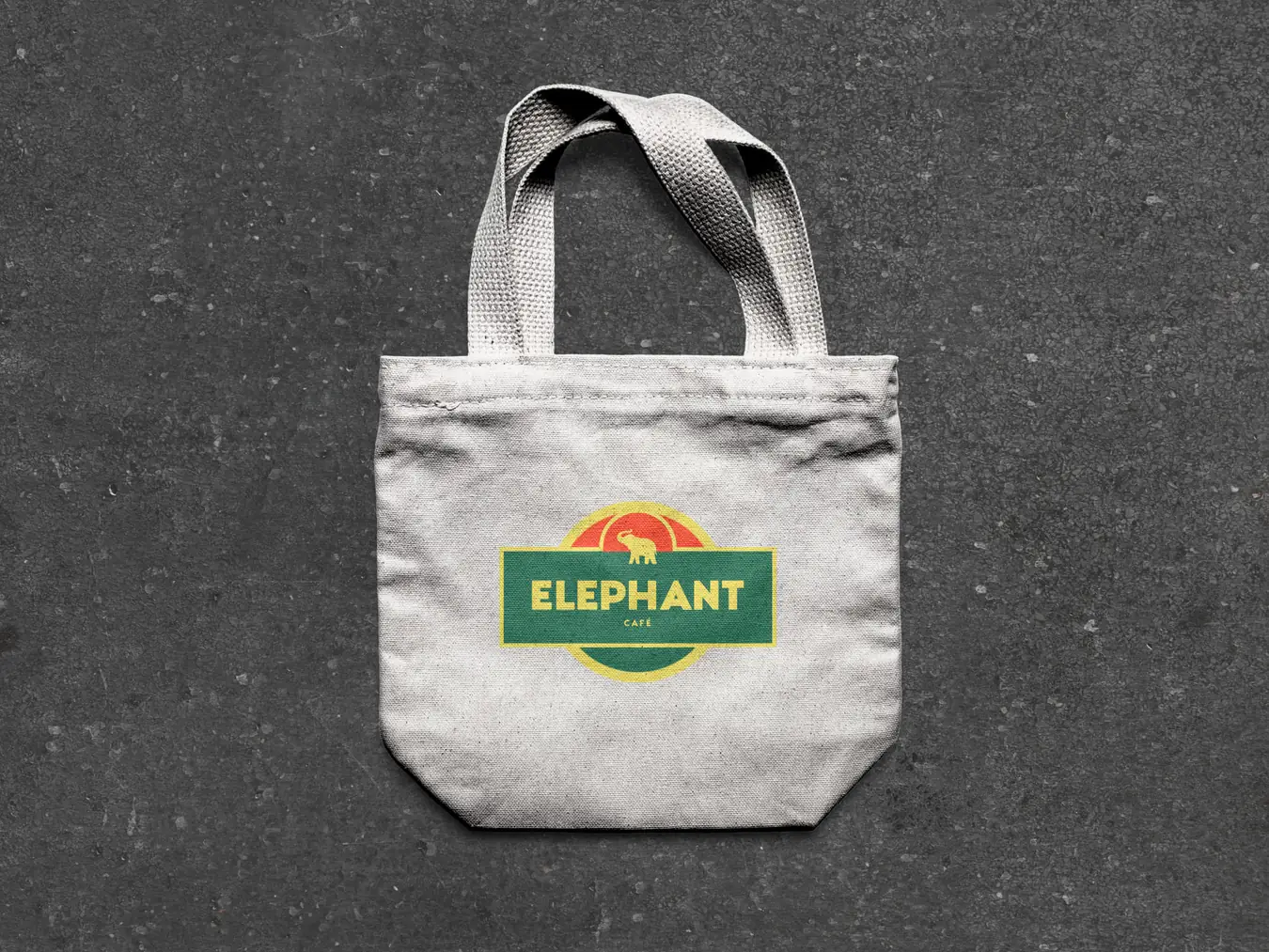
On raw canvas the mark stands alone: sun, elephant and plaque, with no coloured ground to prop it up.
The same bag in its spoken version: “Tastes goooood” with the o’s stretched until they fill the width. The joke is also how the line gets justified.
A third variant, the mark small and centred on the horizon cut: three bags, one system.
In feed the system holds three different registers — claim, promotion, photograph — without changing its rules.
I

UX / UI

Digital products where complexity is the main problem: CRMs to be used on the move, technical catalogues with hundreds of codes, booking for people travelling. I design the flow, the interface and the component system that holds them together.

01

Anima

Namu

A web app for company management and sales negotiations, designed to use AI to streamline prospect onboarding — with a companion app built for people working in the field.

The problem

A CRM has to show a lot of data without becoming unreadable. The problem ran two ways: making the state of dozens of parallel deals legible at a glance, and cutting data entry down to seconds for someone moving between clients.

What I designed

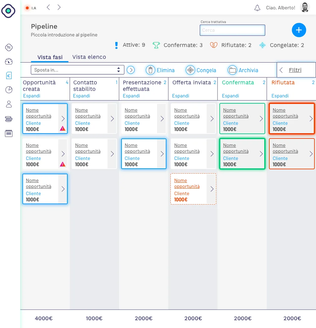
  • A stage view in columns — opportunity created, contact made, presentation, offer sent, won, lost — with per-state counters, total value at the foot of each column and bulk actions: move stage, freeze, archive.
  • An alternative list view over the same data, sortable by title, company, owner, deadline, stage and value: two ways of reading the same work, for two ways of working.
  • A side detail panel with actions grouped by intent — report, schedule, communicate — so the task closes without leaving the pipeline.
  • Trovaclienti: AI segments prospects by spend bracket and offers them for purchase, with summary metrics, comparison against known companies and a history of packages already bought.
  • A mobile app built on a newsfeed interaction model: voice memos, one-tap meeting outcomes, contacts on a map. Handed to the team for React Native development.
  • A documented design system: eight semantic accents and eight grey steps, complete form field states, a hierarchy of primary, secondary and destructive buttons — with the CSS specifications already written for developers.
Stage view: each column is a step in the deal, with per-state counters and total value at the foot.
Detail panel with actions split by intent: report, schedule, communicate.
List view: the same data as a sortable table, for people working to deadlines rather than stages.
Trovaclienti: prospects segmented by spend bracket, with summary metrics and purchase history.
Documented form elements: default, focus, error and disabled states, with the CSS specs alongside.
Button hierarchy: primary, secondary, destructive and disabled, each with its own code.
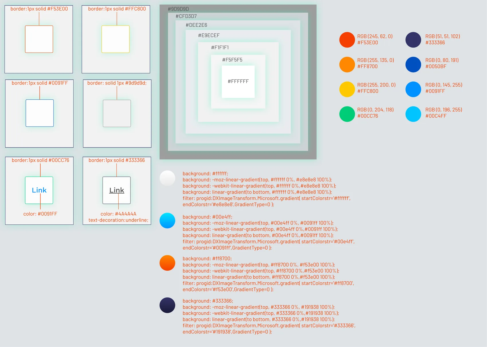
Palette: eight semantic accents and eight grey steps, with RGB and hex values.
Shadows, borders, link states and charts: the last building blocks of the system.
02

DealNow

Namu

A deliberately lightweight app for selling in the field, built around a cycle that closes every twenty-eight days: a list arrives, you work it, you measure what worked.

The problem

Nobody fills in a CRM from the driver’s seat. The job was to reduce every interaction to a single gesture and give something immediately useful back: where the contacts are, how the month is going. It also needed somewhere to put the people who don’t answer first time, who in the field are the majority.

What I designed

  • The twenty-eight day cycle as the load-bearing structure: a new list announces how many contacts it holds and how much time is left, and from there every screen carries the days remaining.
  • Contact list with colour-coded status — new, contacted, engaged, closed — distance from your current position and a contextual action on the card, switchable to map from the same control at the top.
  • Contact record cut down to what you need at the door: phone, address, supply point and price list, with call and navigation as the only primary actions.
  • A feedback loop in a single screen: one question, a face that changes with the answer, four levels, and always a declared way out — call didn’t connect, nobody home.
  • Recovery for the missed contact: if it was the wrong moment you reschedule with date and time in two taps, otherwise you declare it lost. Recoveries land in a list of their own.
  • Personal performance dashboard: status distribution as a donut chart, redemption rate and won/lost ratio on a continuous bar, with an acknowledgement at the end of the month.
  • Product identity: logo, palette and a type scale built on Quicksand, documented in a style guide.
A new list opens the cycle: how many contacts it holds, how many days are left to work them.
All contacts with colour-coded status, distance from where you are and a contextual action at the foot of the card.
The same list as a map: the pins repeat the status colour, with no legend to learn.
Contact record cut down to what you need at the door, with call and navigation as the only primary actions.
Feedback after a call: one question, a face that changes with the answer, and a declared way out.
The same pattern after a face-to-face meeting. Four levels, one send, nothing else.
If it was the wrong moment: reschedule with date and time in two taps, or declare the contact lost.
Reminders carry the right action with them: call if they came from a call, navigate if they came from an appointment.
Recoveries live in their own list, kept apart from new contacts so two ways of working don’t mix.
Personal performance: status distribution, redemption rate and won/lost ratio.
The end-of-month acknowledgement, the system’s one explicit reward.
03

Fintyre

Automotive

An app for the tyre trade, where gamification exists to support dealer sales and hold a community together.

The problem

Tyres are a purchase people postpone until it becomes urgent. The idea was to give the driver a reason to open the app before that moment, and the dealer a reason to get them through the door.

What I designed

  • Only three sections in the top bar — treasure hunt, garage, tire test — because an app opened twice a year cannot ask anyone to learn a navigation.
  • A Garage section: the user’s car and fitted tyres, with wear as a percentage and a traffic-light colour that flags replacement before it becomes a problem.
  • Tire test: photographic tread scanning, with the wheel framed inside a guide circle, to estimate wear and compare the tyres currently fitted.
  • A treasure-hunt mechanic on promotions — find the complete series to unlock the discount — turning app usage into footfall at the point of sale.
  • High-contrast yellow and black direction, condensed italic type, chequered flag and dashed rules: motorsport language, not e-commerce.
Garage: the user’s vehicle, the tyres fitted and wear as a percentage with a traffic light beside it — 89% green at the front, 5% red at the rear.
The treasure-hunt promotion: the discount unlocks by finding the whole series, with the latest finds listed underneath.
The search in progress, drawn as a concentric radar rather than a loading bar.
Tread scanning: the wheel is framed inside the guide circle, and the scan line confirms it is reading.
Tire test cut down to two roads only: compare your tyres, or estimate the wear.
04

International Saws

RichClicks

An online catalogue of circular saw blades, router cutters, drill bits and knives for working wood, plastic and aluminium. Hundreds of codes, each with a spec sheet that decides the purchase.

The problem

Someone buying a blade isn’t looking for a product: they’re looking for the right blade for the material they have to cut and the machine sitting in their workshop. A catalogue organised by category doesn’t answer that question. It had to be turned around and start from the job to be done.

What I designed

  • Filters built on the real problem rather than on the warehouse taxonomy: you start from fourteen materials to be cut — soft and hard wood, plywood, chipboard, veneered, laminate, MDF, plexiglass, aluminium, ferrous and non-ferrous metal — then narrow with sliders on blade diameter, bore diameter and thickness.
  • Technical specs brought onto the list card instead of hidden in the product page: diameter, bore, tooth count and thickness, each with its own icon and its minimum and maximum values. They are read while comparing, which is when they matter.
  • Search with a scope selector beside the field: anyone arriving with a code in mind looks it up straight away, anyone without one stays on the category path.
  • The wishlist works as a quotation request: codes accumulate and are sent in one go. Technical B2B doesn’t end in a payment, it ends in an offer, and the site walks the buyer to that point.
  • A three-level taxonomy across six families — blades, knives, drill bits, router cutters, accessories, sharpening — navigable from the menu, the category grid and the breadcrumb, because a technical catalogue is entered from every side.
  • Editorial pages on the subjects that justify the price: Frozen treatment, hard metal, blade characteristics. In a technical market the explanation is part of the product.
  • Dark ground with a blue accent: the steel of these products is grey, and on white it disappears. Italian and English across the whole catalogue, product codes included.
Home: search with a category selector at the top, the six-family menu always on the left, and the three technical pages explaining why a tool costs what it costs.
The six families with their subcategories already visible: anyone who knows the trade skips a level of navigation.
Product carousel with families as tabs. Every card carries the measurements in plain sight, not just a photograph.
On mobile the header shrinks to language, phone, search and menu: four controls, because a thumb reaches four.
The carousel keeps its tabs in portrait too, with one card at a time filling the screen.
Product list: breadcrumb, filters with a counter of the active ones, and on the card diameter, bore, teeth, thickness and compatible materials.
The full-screen filter panel: fourteen materials to be cut, then the dimension sliders. You start from the job, not from the code.
The wishlist isn’t a cart: it collects the codes and sends them as a quotation request, which in technical B2B is the real act of buying.
05

SAIS Autolinee

RichClicks

A Sicilian coach company running since 1926: more than a hundred and ninety buses, over three and a half million passengers a year. The site has to sell a ticket and at the same time carry the obligations of a public service.

The problem

Three different audiences on one homepage: the tourist booking a long route, the commuter renewing a season pass, someone after an urban ticket worth a couple of euros. Each is in a hurry in a different way, and none of the three should trip over the other two.

What I designed

  • A trip search engine on the first screen, laid over the image rather than pushed below it: origin, destination, outbound, return and passengers. The swap button between the two places saves retyping everything when looking for the way back.
  • The return is a dashed, optional field and the outbound date arrives pre-filled with today: the shortest path is pressed first, the others stay one tap away.
  • Urban tickets have a colour of their own, green, and sit outside the route search box. Two different products living on the same screen without being confused for each other.
  • Season passes on a tab beside tickets: they need the travel card and therefore registration, and the constraint is stated at the exact point where it blocks, not two screens later.
  • On mobile a Buy bar stays anchored at the foot of the whole page: you can read the company history, the routes, the FAQ, without ever losing sight of why you came.
  • Service promises spelled out before the purchase — digital ticket, contactless on board, booking changeable up to departure, Wi-Fi and sockets, 1+1 luggage — with the FAQ picking up whatever objections remain.
  • The network navigable by city as well as by route, with cards that speak about the place before the timetable, and public service obligations — service charter, conditions of carriage, complaints, accessibility — built in without weighing down the purchase path.
The trip search sits over the image, not under it: origin, destination, dates, passengers. And urban tickets, in green, stay outside the red box.
Routes told starting from the city: Ballarò, the Vucciria, Etna. Anyone choosing a destination isn’t choosing a timetable.
Ten million kilometres a year, a hundred and ninety buses, three million seven hundred thousand passengers, a hundred years of service: trust stated in figures.
Frequently asked questions as an accordion on a dark ground, right before the partners: the last objections cleared before leaving the page.
On mobile the search form becomes the first thing under the image, with stacked fields and the swap button between origin and destination.
The menu carries search, language, phone, email and social with it: everything needed by someone who is stuck and wants to talk to a person.
Service promises as cards: digital ticket, contactless on board, changeable booking, Wi-Fi, luggage. Below, the Buy bar stays anchored.
The cities in portrait, one card at a time, with the purchase bar always within thumb reach.
Even at the foot of the FAQ the purchase stays anchored: you can read everything without ever losing the reason you came.
III

Typography & type design

Typefaces drawn on commission or released commercially, plus the work that makes them visible. It’s the discipline my way of working comes from: closed systems, rules before exceptions.

01

Typographic visuals

Milan, 2020–2025

Visuals and lettering to promote the typefaces designed over the years, and for covers, posters and titles on commission.

The problem

A typeface is only visible when somebody uses it, and that opens two opposite problems. In promotion, nobody looks at a glyph chart, and the signs that would say the most — currencies, mathematical marks, brackets — are exactly the ones that never turn up in a specimen text. On commission the problem inverts: the letter has to carry content that isn’t its own — a title, a date, a cover — without turning into decoration.

What I designed

  • One device in the promo posts, repeated: a circle over the glyph. Translucent, it blurs the stroke; solid, it covers it. Either way the shape has to be rebuilt in the head, and that is what holds the eye on a single letter instead of letting it skim a whole alphabet.
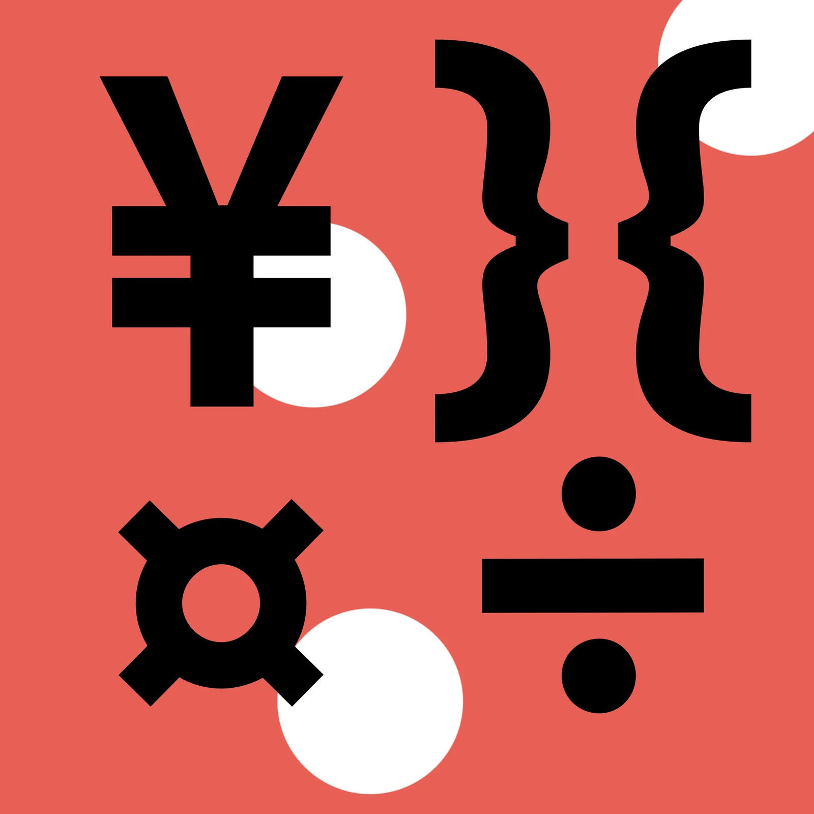
  • As the subject of those posts, the part of the set usually left out: pound, yen, generic currency, times, division, braces. These are the glyphs that tell you whether a typeface is finished.
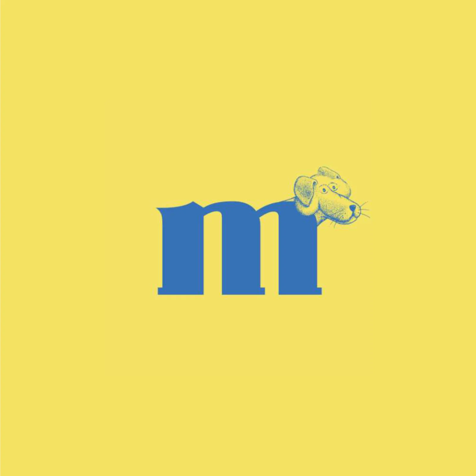
  • In the commissioned work the letter is structure, not ornament. In the m the dog’s head grafts onto the last stem and the arches become its legs; in The OG the portrait’s neck runs down into the O.
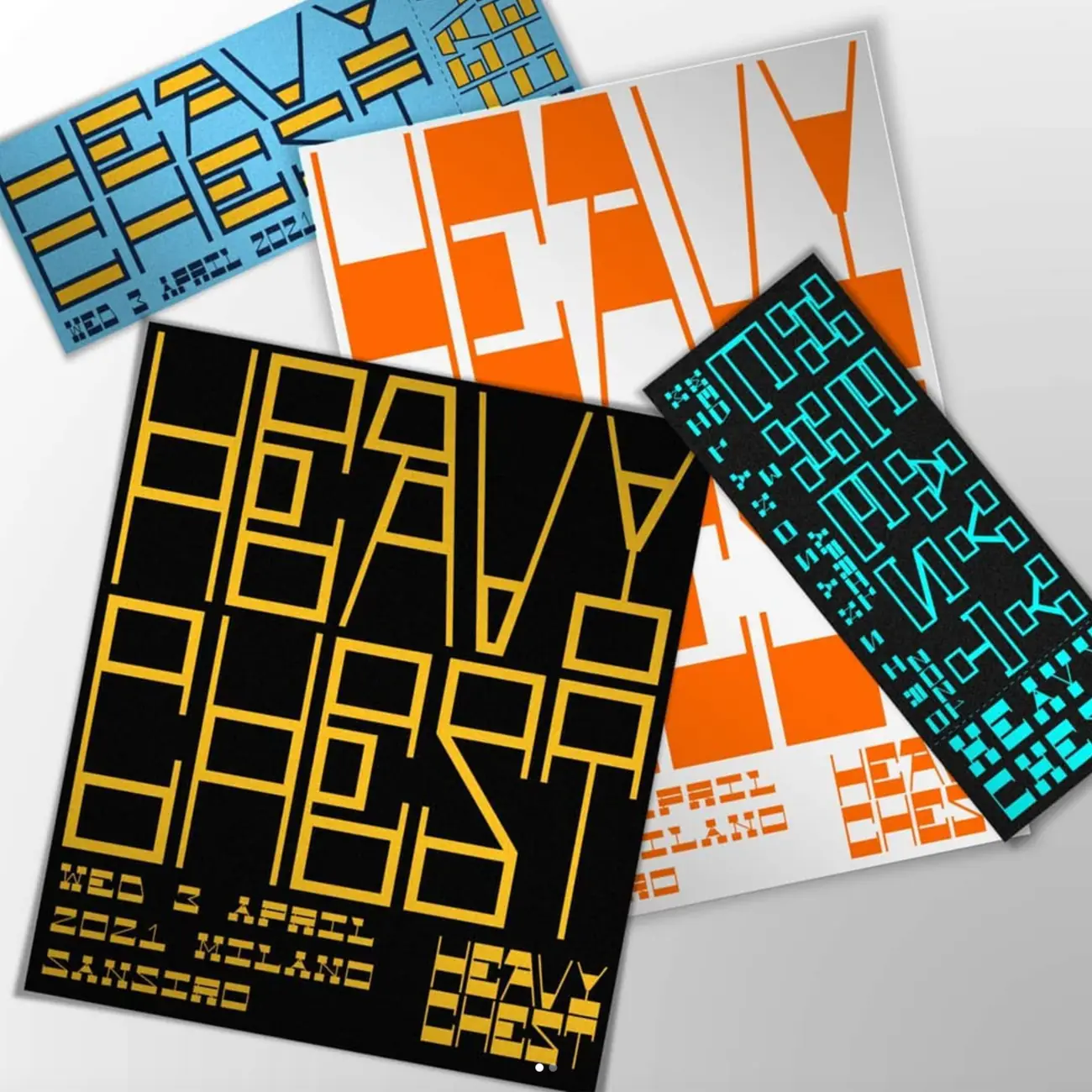
  • Where a system was needed rather than a single drawing, a modular alphabet built on a grid: Heavy Chest is one alphabet recomposed across poster, ticket and flyer in four colour pairings.
  • Titles over images kept legible with an outline rather than a band behind them, so the photograph stays whole under the text.
  • On records the typeface goes into the credits like every other trade: on the back of observer by |rg| the type design is credited next to the mastering.
A translucent circle over the glyph: it blurs the stroke instead of magnifying it, so the shape has to be completed in the head. It is a way of stopping the eye on one letter.
Same device, solid circle instead of translucent: it covers. And as subject, the part of the set nobody shows — yen, generic currency, braces, division.
Cover for observer by |rg|: on the back the type design appears in the credits, next to the mastering. The typeface isn’t illustrating the music, it is one of the entries.
A modular alphabet on a grid, recomposed across poster, ticket and flyer in four colour pairings. The format changes, the alphabet doesn’t.
A title over a frame: the three lines interlock and a thin outline lifts the letters off the image without needing a band behind them.
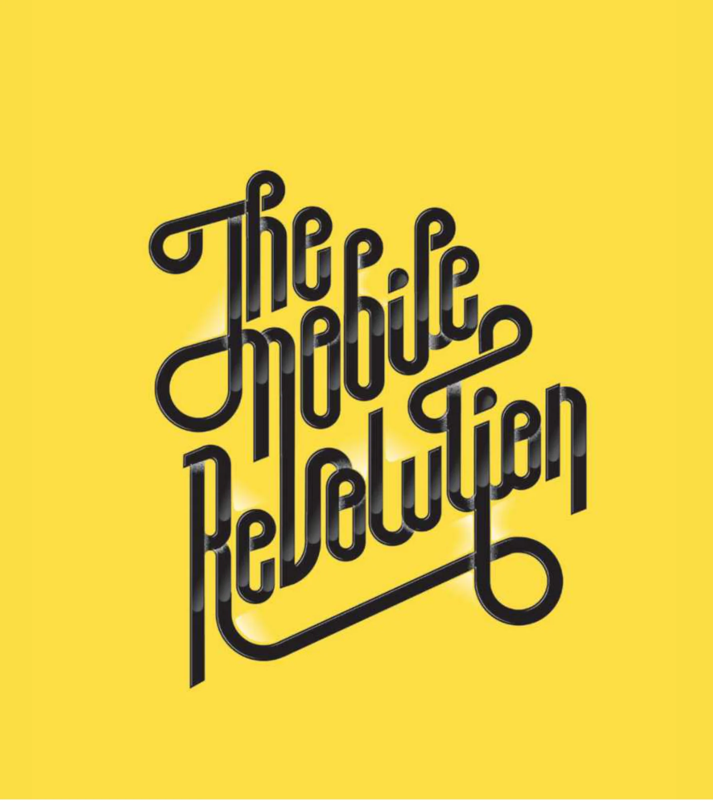
Monoline lettering on a slanted baseline: the stems extend into loops that close the composition at all four corners, so the block stands on its own without a frame.
A stippled portrait and a display serif on one board: the figure’s neck runs down into the O, so illustration and word are not two stacked elements but one.
Here the letter is the animal: the head grafts onto the last stem of the m and the two arches become the legs. The drawing doesn’t decorate the letter, it uses it as a skeleton.
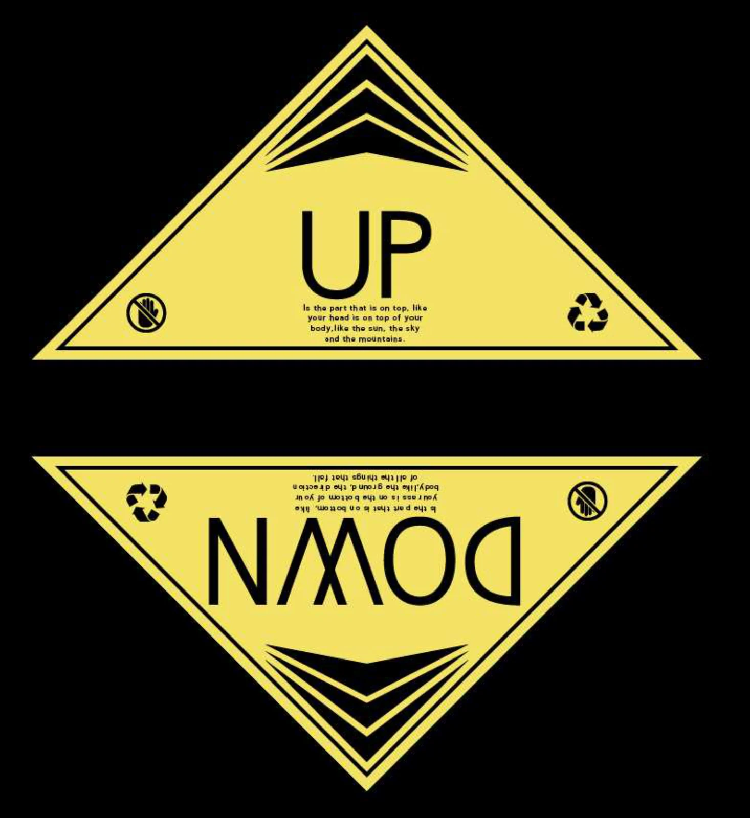
Shipping labels with the real symbols — arrows, recycling, do not handle — and the definitions of up and down in place of the instructions. The lower panel is upside down: it reads only when the box is the wrong way round.
02

DG Mantegna

Politecnico di Milano

A typeface commissioned for the exhibition “Andrea Mantegna, Pittore Mantovano”: serif capitals with a sans lowercase, in six weights.

The problem

A typeface for an exhibition about a fifteenth-century painter, commissioned by a polytechnic’s architecture programme, has to be in two places at once. Look only to the Renaissance and it becomes historical pastiche that no longer belongs to the institution showing it; look only to the present and the painter’s name on the cover carries no authority. And it has to hold both the title on the wall and the caption in the catalogue.

What I designed

  • Two systems in one alphabet: serif capitals, sans lowercase. Not two cuts to alternate — the jump happens inside the word, the only place where the two periods actually touch.
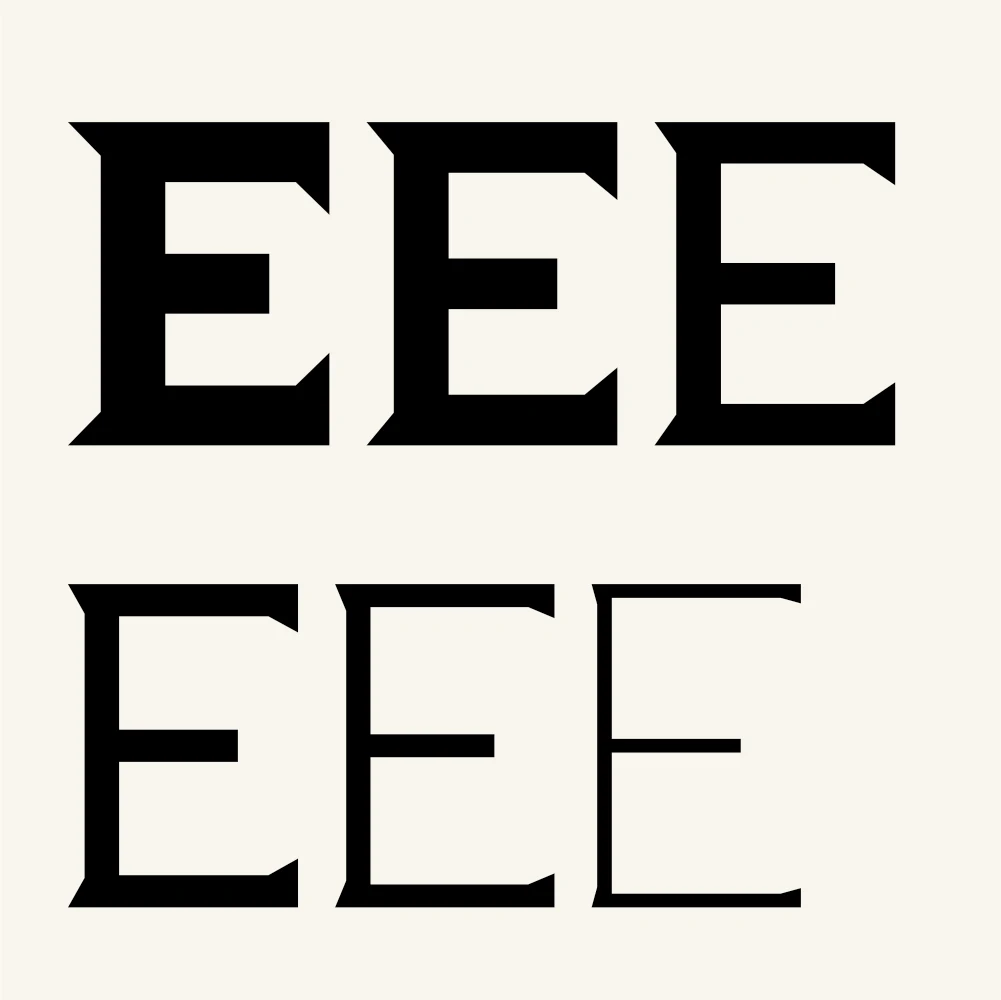
  • Wedge serifs, cut on the diagonal rather than bracketed: they read as carved, not written. That is where the architectural half of the reference comes from.
  • A lowercase built on circles and straight stems, close to monoline. Its job is to stop the two systems competing: the capitals carry the historical register, the lowercase keeps the text in the present.
  • Six weights, with serifs that don’t thin in proportion to the stem: at the light weights they would vanish, and the reference with them.
  • An extended Latin set drawn rather than inherited — Æ, ß, Ð — because a public exhibition prints names and loans from other languages.
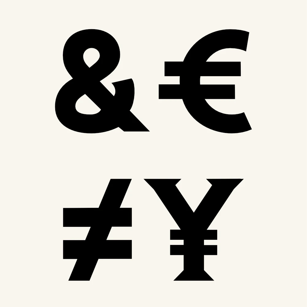
  • Punctuation and symbols assigned to the right system: dots and braces follow the geometry of the lowercase, currencies carry the serifs of the capitals.
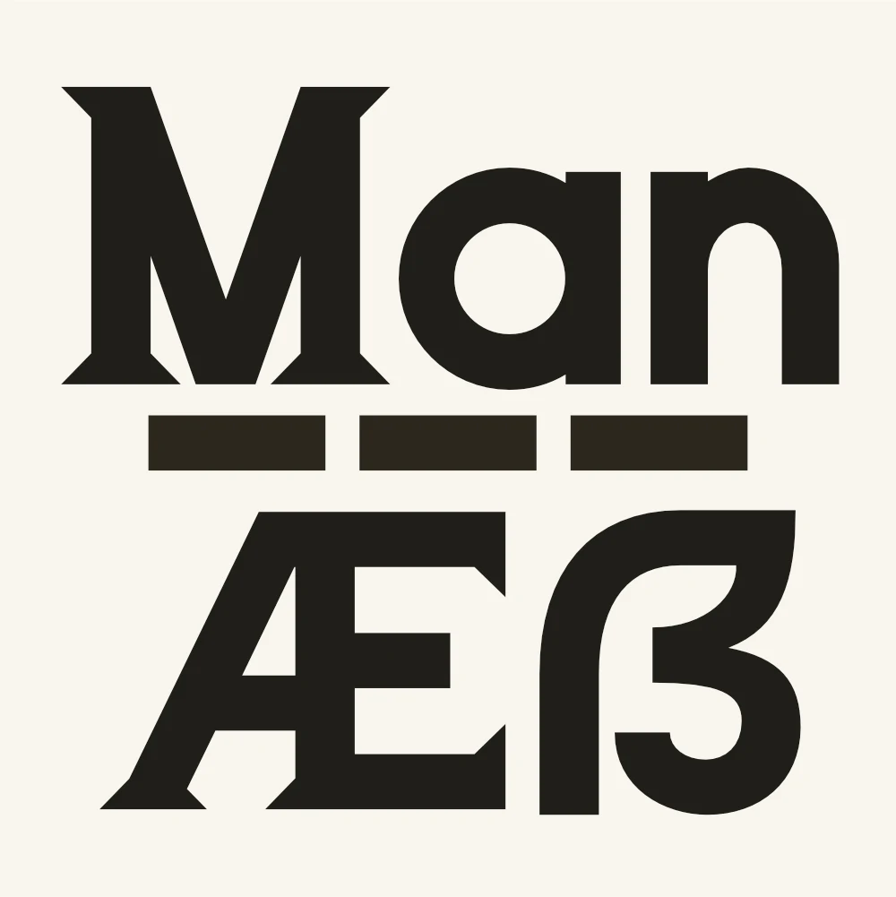
The whole face in one word: the M has serifs, an does not. The system changes inside the word, not between one text and the next.
The same mix holds at every weight: a serif F with a sans y and i, from light through to black.
Six weights on one letter. The serifs don’t thin in proportion to the stem: they stay cut wedges, because at the light weights they would otherwise disappear.
The lowercase is built on circles and straight stems, close to monoline. That is what lets it sit beside the capitals without competing.
Ð, Æ, ß: the extended Latin set is drawn with the capitals’ own serifs rather than inherited from another face.
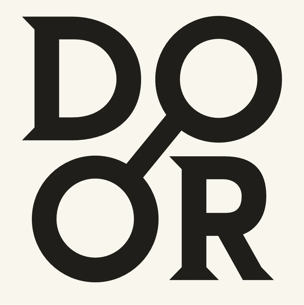
The two Os joined by a diagonal stroke: the composition closes into a square and the word becomes a mark.
Symbols and currencies cut on the same diagonals as the letters — visible in the ¥, which carries the serifs of the Y.
Geometric punctuation: circular dots, rectangular dashes, a brace built from full curves. It follows the lowercase, not the capitals.
03

DG Morbegno

Variable typeface

A sans display face drawn as a variable font: one weight axis running from hairline to black, at low contrast. For headlines, brands and mastheads.

The problem

A variable display face has to hold two extremes that are usually drawn as separate typefaces. At minimum weight the stems go to hairlines and the curves tend to disappear before the verticals do; at maximum weight the counters close and the letters collapse into blots. Between them sits an infinite number of weights nobody draws by hand: they have to come out of the interpolation already correct.

What I designed

  • Contrast kept low and constant along the whole axis: curves and stems are near enough the same thickness at every weight. That is the condition for the hairline to stay a continuous line instead of breaking where the curve thins out.
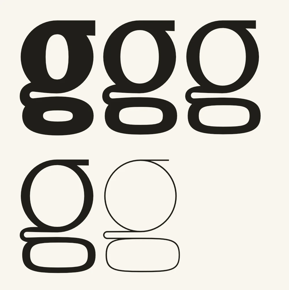
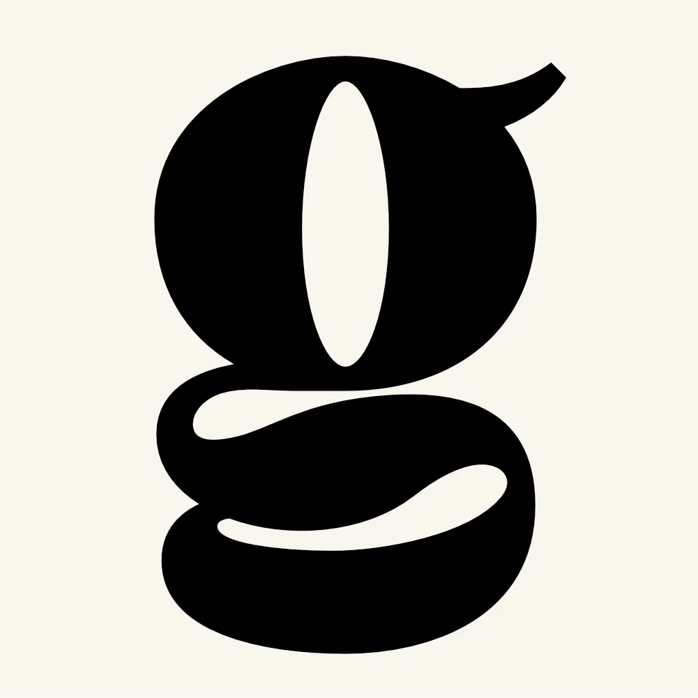
  • One skeleton for the whole family. The double-storey g shows it plainly: a circle, a rounded loop and a connecting stroke, the same at every weight — only how much they thicken changes.
  • Counters reduced to simple geometric shapes so they stay open at black: in A and 4 the void is a minimal triangle, enough to tell the letter apart once everything else has closed.
  • The extended set carried across the whole axis, not just the middle weights: accents, currencies, mathematical signs and braces all reach black. A headline containing a price or a formula shouldn’t have to change typeface halfway.
  • At the extremes the non-alphabetic signs take on shapes of their own: at black the brace becomes a solid S cut flat at both ends, the tilde on Ñ flattens into a compact stroke to stay under the line height.
  • Built as a variable font rather than a series of static weights: the user picks the exact point on the axis, and the named weights are instances of it, not separate files.
Black and hairline in one lockup: they hold together because the skeleton doesn’t change, only the weight does.
Numerals at maximum weight and words at minimum, at the same size: hierarchy built on the axis rather than on scale.
At the light extreme curves and stems are the same thickness: low contrast is what keeps the bowls from vanishing before the verticals.
At the black extreme only the minimum stays open: the counters of A and 4 are two triangles, and that is enough to keep them apart.
The double-storey g along the axis, skeleton at the end: circle, loop and connecting stroke are the same at every weight.
At black the brace loses its thin stem and becomes a solid form, cut flat top and bottom so it stays inside the column.
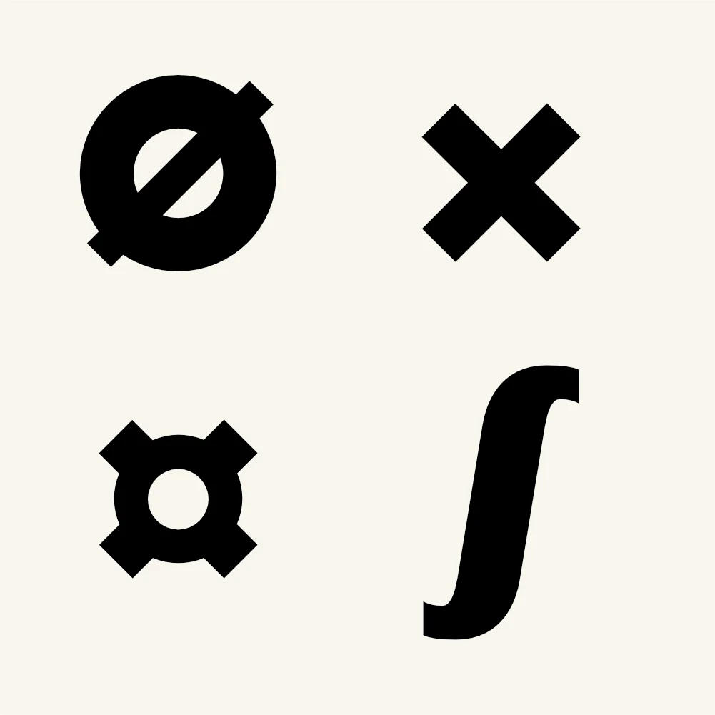
Slashed zero, times, currency and integral: the non-alphabetic signs travel the axis like the letters, so a headline with a formula in it doesn’t change typeface halfway.
The tilde on Ñ is flattened into a compact stroke: at maximum weight there is only so much room above the cap.
04

DG Oxilia

Text Sans

A geometric sans built from circles and straight stems, with a single-storey a and g — the shapes children are taught to write. Drawn to hold long text without losing that quality.

The problem

A sans built on the circle is normally a display face. In long text the circle is a liability: round letters take more room than straight ones, the rhythm loosens, and a single-storey a strips the word of one of its strongest recognition cues. The same shapes that make a typeface likeable at 60pt make it tiring at 10. Oxilia had to do both: stay readable across full pages and still work when it is large and the words are few.

What I designed

  • The lowercase on one circle, repeated: o, b, d, p and q are the same shape rotated and mirrored. That is where the plain look comes from, and near-zero contrast keeps it plain as the text gets denser.
  • Single-storey a and g: these are the shapes taught in handwriting, and they are the exact reason the face reads as ingenuous. A stated choice, not a leftover of the geometric construction.
  • The capitals, by contrast, are not geometric: they keep classical widths — narrow B E F P R S, round C G O Q, wide M W. An alphabet of uniform-width capitals comes apart in a headline. The face changes system between the two cases, and that is what lets it hold two registers.
  • Small breaks from the geometry where long text needs them: the t is cut on a slant at the top of its stem, the y descends on a straight diagonal rather than a tail. They are footholds — in a line of circles the eye needs something that is not a circle.
  • Generous ascenders above the x-height: in a paragraph they keep one line clear of the next as much as the leading does.
  • The extended Latin set drawn on the same skeleton: the tilde on Ñ is a full wave, and the bar of the Ø runs past the circle at both ends so it cannot be mistaken for an O at small sizes.
05

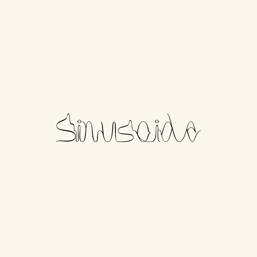
DG Sinusoide

Milan, 2021

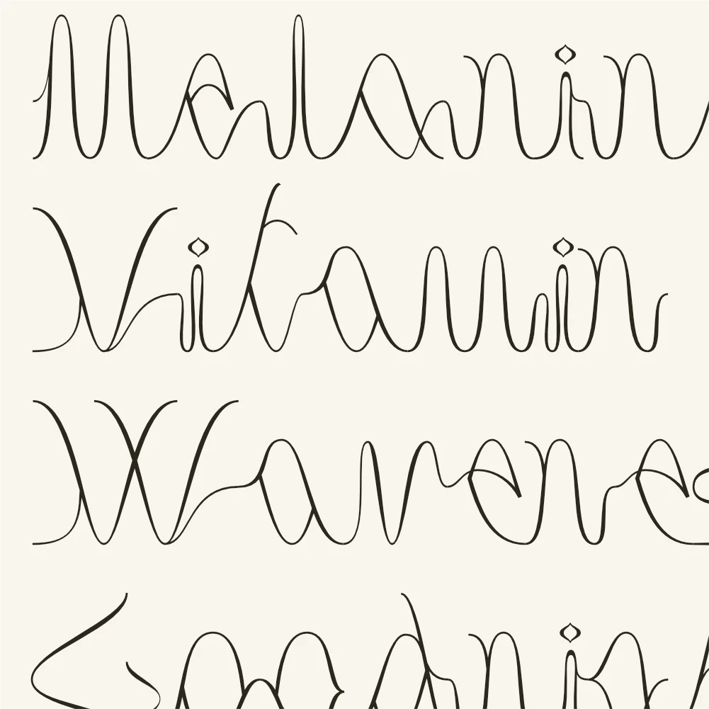
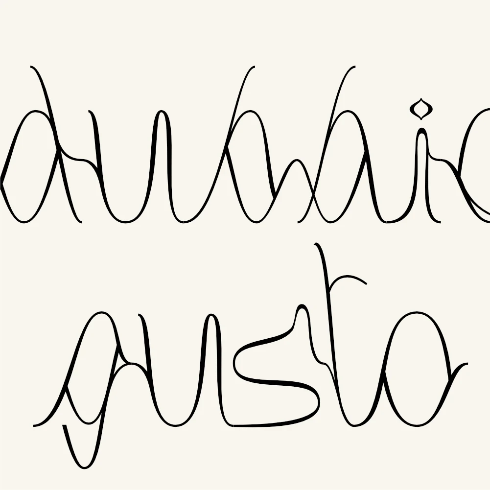
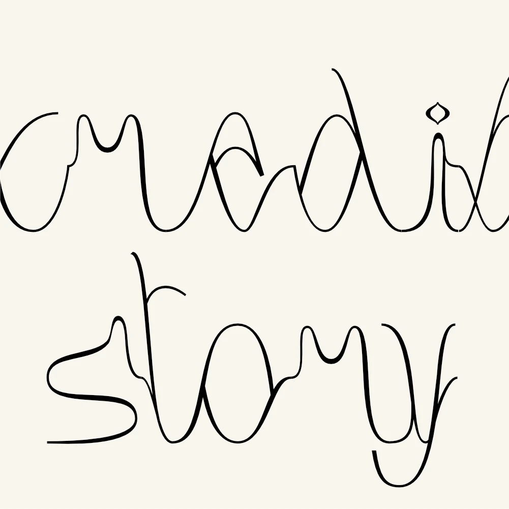
An alphabet drawn from one shape: the sine wave, the way sound is put on paper. The curve was cut and deformed until it became letters, and it doesn't stop where the letter does.

The problem

A sine wave can do almost nothing an alphabet needs. It has no thicks: it cannot give weight to a stem. It has no corners or terminals: it cannot close an A. It never breaks: it cannot make the dot on an i. And above all it encloses no space, while a, b, d, g, o, p and q live on closed bowls. The constraint was to keep the starting shape legible in every glyph, rather than using it as a pretext and then drawing normally the moment it became inconvenient.

What I designed

  • One amplitude across the whole alphabet: the letters are different cuts of the same wave, not independent drawings. It is why a line of text reads as a single undulating line even when there are fifty letters in it.
  • Constant weight, with no modulation at all. A sine wave has no thick and thin points, and the moment contrast is added the letter stops looking like a wave and starts looking like a script.
  • Strokes do not stop at the letter's edge: they run past it and overlap the next one. The space between two letters is not a gap but the continuation of the curve, which turns spacing from a technical problem into part of the drawing.
  • Bowls close by crossing, not by joining: the curve passes through itself. It is the only way to get an enclosed space out of a line that by nature never returns to where it started.
  • Ascenders and descenders are crests and troughs of greater amplitude, not extended stems. The line therefore has an uneven high-and-low profile, which is exactly what a sound trace looks like.
  • One element alone does not derive from the curve: the dot on i and j, a small diamond. A wave cannot produce a dot, and replacing it with a fragment of curve would have made it unreadable. It is the declared exception that makes the rule visible.
  • Legibility deliberately held at the edge: some capitals are hard to recognise in isolation and only resolve inside a word. This is a face for headlines and marks, not for text — that is the choice.
06

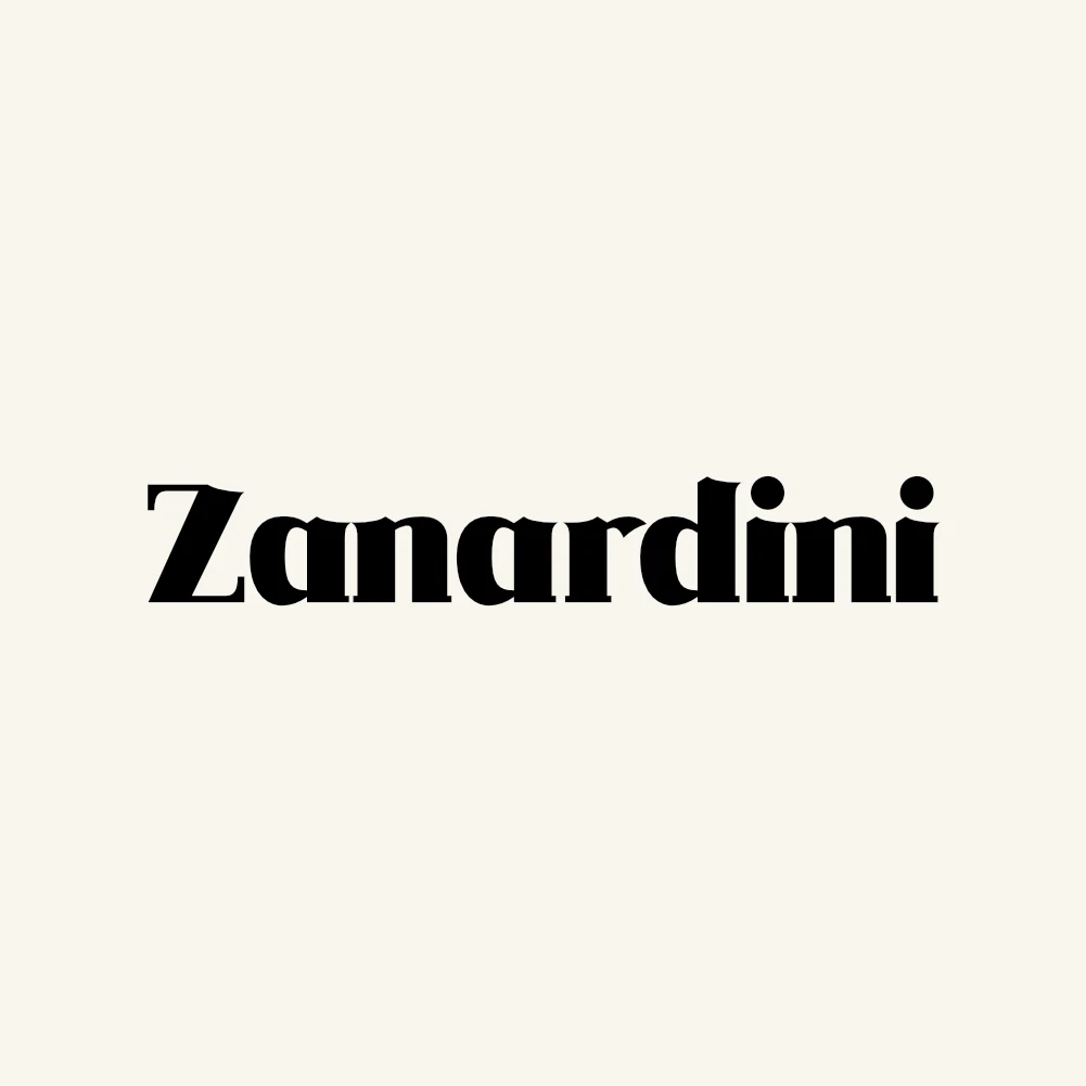
DG Zanardini

Milan, 2023

A high-contrast display serif: solid stems and hairline joins, in a single weight. For headlines, marks and signage.

The problem

A single-weight typeface has no way out. There is no lighter cut to fall back on when it sits too heavy, and no darker one when more force is needed: whatever it does, it does in one version. High contrast makes the sum harder, because solid stems and hairline joins tighten the counters, and the same letter that is crisp on a sign closes up when it drops to a headline on paper. And there is a question of tone: a strongly contrasted serif looks immediately like nineteenth-century advertising, and then the face isn't contemporary, it is a quotation.

What I designed

  • Contrast pushed hard, but with a stated minimum for the counters: in e, a and o the inner space is a narrow slit that never closes. That slit is the limit below which the letter would fill in at the smallest size the face is used.
  • Thin, flat serifs, barely bracketed: they cut across the stem rather than growing out of it. It is the detail that keeps the face clear of nineteenth-century pastiche — the historical reference sits in the contrast, not in the joins.
  • Teardrop terminals on a, c, f, r and y: the only rounded elements in an alphabet otherwise made of straight cuts. They are the elegant part, and they are few by design — one per letter, never two.
  • One weight, not a family. The face is built for a range of sizes rather than a range of weights: everything a text face would solve by switching cut has to be solved inside a single drawing here.
  • Figures, currencies and accented letters drawn with the same care as the letters, not bolted on at the end. A headline or a mark often carries a year, a name with an accent, a symbol: if those are weaker it shows at once, because they are as large as everything else.
  • In the symbols the horizontal bars hold the hairline weight and the curves hold the stem weight. The sign then carries the same colour as the letters beside it, instead of becoming a lighter or darker patch in the line.
  • Accents sit low and wide, close to the letter: at display sizes a thin, tall accent detaches from the body and reads as a smudge.
How I work

A project is a system, not an artefact.

I spent years drawing typefaces. It’s work that teaches one thing, repeated thousands of times: every element exists in relation to all the others, and consistency is built up front, in the rules, not afterwards, in the fixes.

Applied to an interface, that means starting from the flow and the states — what happens when the field is empty, when the connection drops, when there is too much data — and arriving at the screen as a consequence. Applied to a brand, it means handing over rules that outlive whoever applies them after me.

The rest is listening: to the client, to the stakeholders, to whoever will actually use the thing. I’ve worked with teams in Italy, the United States, the United Kingdom and India, and the hard part was never the software.

Direction and consulting
Creative direction, coordinating designers, client management, presenting to stakeholders, defining method and process
Product & UX
User flows, information architecture, wireframing, prototyping, interaction design, SaaS, mobile apps
UI & Design Systems
Design systems, component libraries, style guides, design tokens, responsive, Material Design, data visualization, handoff
Brand & Typography
Brand identity, brand books, packaging, art direction, type design, typeface development, lettering, editorial, illustration
Tools
Figma, Adobe CC, Glyphs, After Effects, HTML/CSS, JavaScript, Python
In progress
Information security, red teaming of AI systems